Fixo is an app that provides de means to contact a contractor to make a repair or installation in a safe, secure and speed way.
CHALLENGE
It is never easy in Buenos Aires to find a professional that will do home repairs or installations. The price, deadlines and reputation of the professional can be mysterious and a source of dissatisfaction that adds to the primary problem that needs to be solved.
METHODS
Interviews, desk research, benchmarking, archetypes, storytelling, minimal value product, Information architecture, card sorting, wireframing, prototyping, UI Kit, atomic design, heuristics and usability testing.
APPROACH
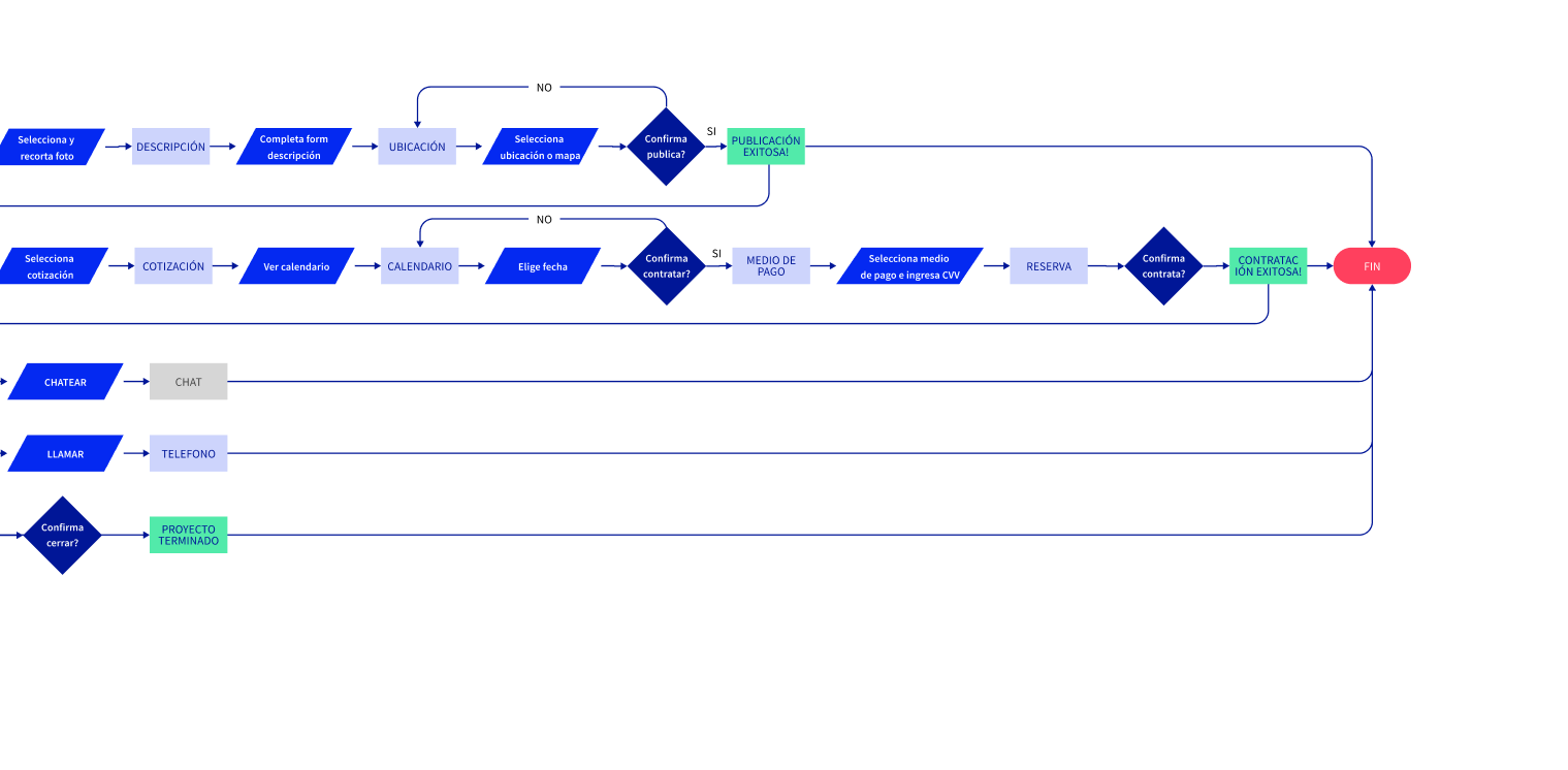
The goal of the project was to streamline and make the link between a client who needs to install or repair something at home and the provider more transparent and fluid by creating a space to publish the project and get quotes from providers with validated skills. Each provider will set a value for their hour of work and will quote based on the hours they think it will take them to do it. The platform will allow you to select, contract and pay safely when the work is finished.
SO, WHAT'S THE STORY?
DESK RESEARCH
BENCHMARKING
TASKRABBIT
TIMBRIT
UBER (inspiring functionality)
App dedicated to hiring taskers to help you assemble, move and repair household items. Allows you to compare prices, hire and assess. Associated with IKEA.
App that allows you to contact, hire and assess “trusted professionals” from more than thirty different categories ranging from Events and well-being to Blacksmith and Security.
It allows you to hire, pay and value a driver to complete a known route for a pre-established price that is based on location, time and vehicle demand.
Up to date and intuitive.
Few steps to complete primary actions.
No info regarding price of completed work (only hourly rate).
Not available in Argentina.
Not available for android (only PC). Only available in the Apple Store launch version and web version.
Anachronic design.
Clients make contact with provider through app but continue the relationship privat.
Everybody knows Uber.
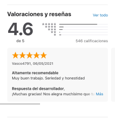
We’ll try to imitate the possibility to know and compare finale prices, ease of use and minimalistic design
UNIVERSE OF APPLICABILITY
There are around 15M homes in urban zones of Argentina. If we consider de scope of this app to be home repairs, we can say that there is at least a potential user for each house.
TRENDS
The press outlets seem to show a growing interest in the matter especially after the pandemic. From the customer point of view, people wants to adapt and better their home that has become a place where they spends more time as well as from the workers point of view. for people are now more interested in freelance options.
WE FOUND OUT:
There is no digital product in Argentina that effectively addresses the problem.
Similar applications exist in other parts of the world, notably in the US and Europe, the operation of which should be adapted to the needs of the local market.
The universe of application is large and the number we arrive at is conservative.
Google trends show little interest in Argentina for existing applications, probably due to ignorance of their existence.
USER PERSONA
Objectives and goals
He doesn’t want to waste time looking for a technician every time his toilet tank breaks or he needs to install a new electronic device.
Motivations and frustrations
Amadeo is motivated by new technologies that serve to make life easier and do not cause discomfort. He gets frustrated when something stops working, and he doesn’t like to wait weeks to install a new device.
BIO
Amadeo is a successful professional. He lives alone in a new apartment. He likes to live well and keep up with the latest technologies. He is decisive and expeditious. He is quite meticulous with cleanliness and order in his house. He likes everything to be in his place and to work. He spends a lot of time on his cell phone and adopts all the new habits that buy him time.
AMADEO
Demographics
Lawyer
29 years
Single
He lives in Buenos Aires
Skills: 5/5 Digital native.
CARMEN
Demographics
Employee
56 years
Single again
Lives in Vicente López
Skills 3/5
Objectives and goals
She wants to solve her house problems quickly with technicians she can trust and who can adapt to her difficult times.
Motivations and frustrations
She wants to enjoy a weekend without having the feeling that the house is falling on her. When she gets someone to recommend a plumber, for example, matching schedules is next to impossible. She is also scared of letting strangers into her house. She juggles money so every time a problem arises she suffers.
BIO
Carmen is an administrative employee in a factory and the mother of two teenagers. She lives in a house that is already old and every day a new problem appears: the water heater leaks, the stove does not turn on, the power goes out. Her children are good but they help her little.
POV AMADEO
Amadeo is a lawyer, pragmatist and a lover of technology, he is thinking of installing a modular and changing the color of the living room wall, for which he needs to budget and hire labor in an agile and precise way because he does not want surprises when paying , nor that your house becomes a construction site indefinitely.
POV CARMEN
Carmen works full time and lives with her two children in a big and somewhat old house, she has to do a lot of repairs and needs lenders who charge a reasonable rate and who she can trust because she doesn’t have much time or money, and at home only known people or acquaintances of acquaintances enter.
interviews
In order to validate our proto-personas, we designed a questionnaire with a focus on the user’s relationship with digital service products in general and with the problem in particular. The questionnaire focused on open questions that allowed the interviewee to elaborate, going from the general to the particular. We interviewed six potential users chosen based on our proto-personas. Based on the results of the interviews, an empathy map was generated where the insights we were able to extract were captured.
insights
The interviews allowed us to corroborate our proto-personas. They all emphasized the uncertainty regardin g the provider, the time and the price they will pay. The digital solution, the possibility to pay by card and the existence of a rating system seems to appeal to everyone regardless of skill level.
MVP
minimum valuable product
Based on the desk research and on the user personas we brainstormed all the possible functionalities that would fulfill the requirements. We then filtered and selected the most important of them, without which the solution would not make sense.
INFO ARCHITECTURE
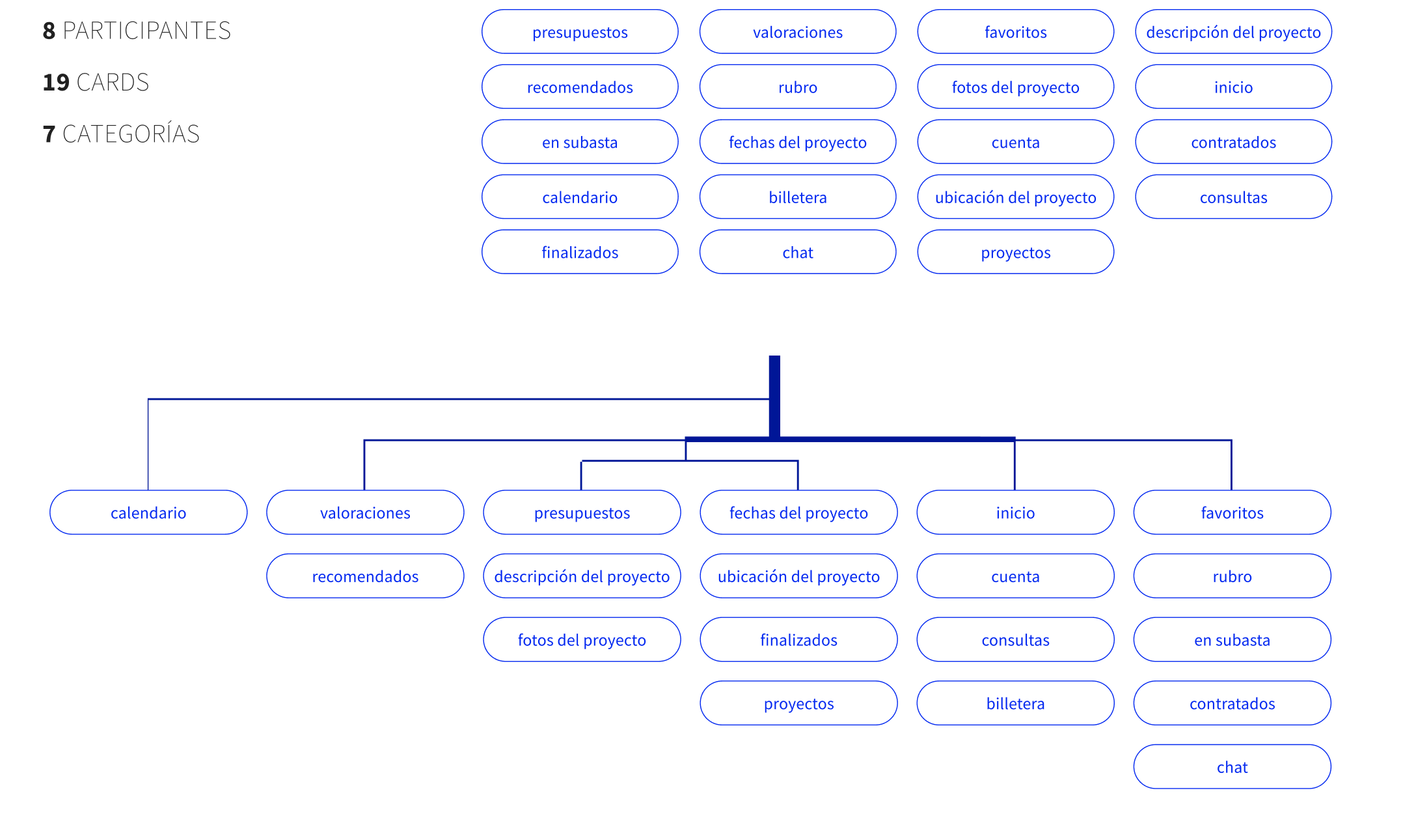
card sorting
The ideal order of the information is the one that fits the mental model of the users. To structure the information, an open card sorting was carried out, inviting 10 potential users to classify and label cards according to their criteria. The cards were created according to a provisional inventory of contents. According to the results of the card sorting we will be able to make a first approximation to the information architecture. Only 7 out of 10 people completed the cardsorting, which gives us an indication of the skills of the user persona Carmen.
similarity matrix
We can observe a great degree of similarity induced by the name of the cards ending in “of the project”. The rest of the cards prove not to match intuitively enough. Especially the calendar card does not seem to find a place from the users’ point of view.
what we learnt
The results of the card-sorting gave us the pattern that there was a lack of clarity in the cards. They did not allow intuiting its functionality. To build the information architecture we had to reconsider the names of the cards and their order. To corroborate this architecture we will have to carry out another card sorting, this time closed. The calendar, as indirectly suggested to us by users, was removed as a card.
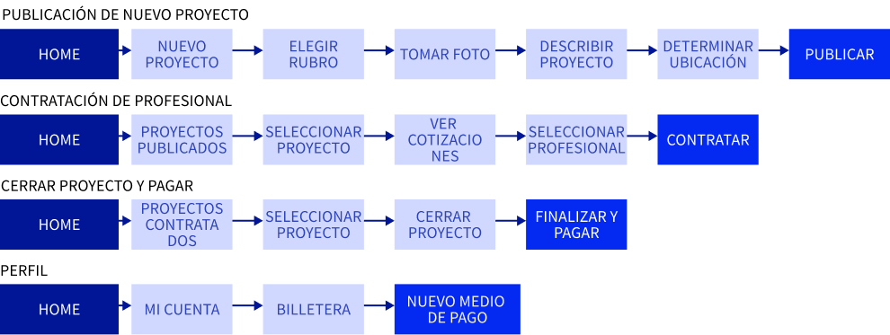
TASKFLOW
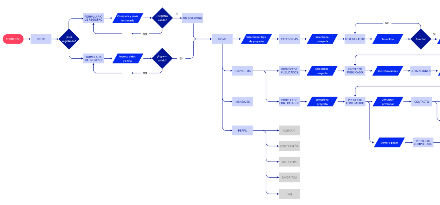
Info ARCHITECTURE
USERFLOW
MOODBOARD
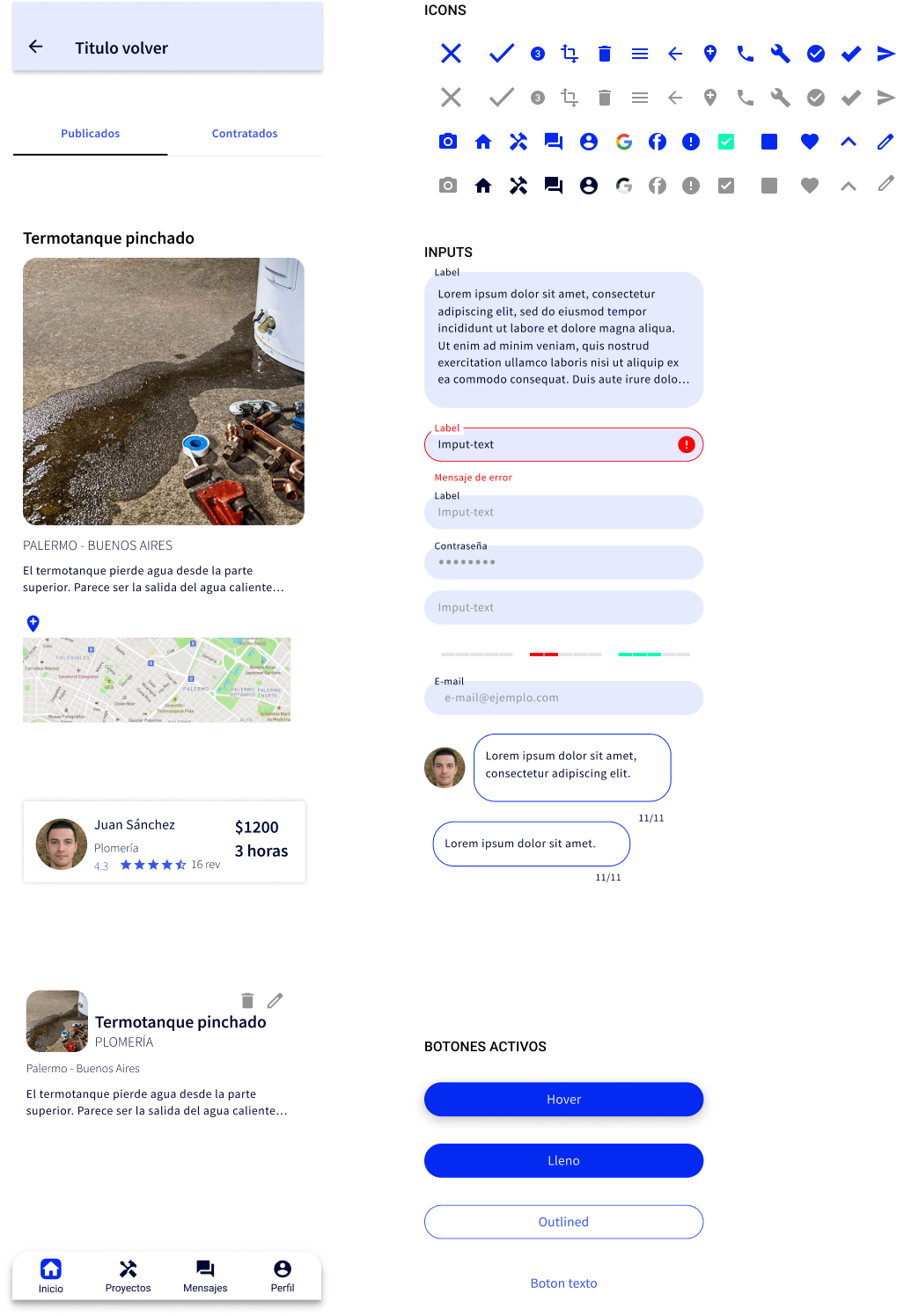
UI KIT
TIPOGRAPHY
COLOR SYSTEM
ONBOARDING
ATOMIC DESIGN
WIREFRAME EVOLUTION
HEURISTIC EVALUATION
CONCLUSIONS
During the construction of the wireframes we detected the need to add processes and interactions to facilitate the “happy path” of the user. From the design of the functional prototype and its heuristic evaluation, problems and improvement opportunities arose that will be implemented before carrying out the usability tests. The app also has affordance issues that were only recently detected when running it on a mobile device. Perhaps the most important icon of the app (projects) has not yet been decided. Meanwhile, a watch fulfills the role of place-holder.
USABILITY TESTS
INTRODUCTION
OBJECTIVE: Verify and understand the strengths and weaknesses of the designed flow and interface. METHOD: Interviews via zoom. Users had access to the prototype through a link and shared the screen allowing us to see how it was handled. PARTICIPANTS: We are looking for potential users that fit our user personas.
SCENARIO
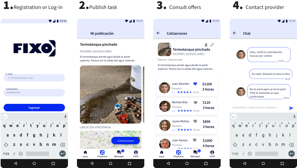
To guide users on their journey through the App, it was explained to them that they should position themselves in the shoes of someone who immediately needed it. To that end, they were asked to pretend (during the course of the test) that her name was Carmen, that their hot water tank had been punctured, and that they needed a plumber. The users were specified that they should do the following tasks, explaining to them that in a real situation not all the tasks would be done at the same time but that for the purpose of the test they would be concatenated. 1. Registration or Log-in 2. Publication of a notice 3. Consultation of quotes 3.1 View quotes 3.2 Select provider 3.3 Select date 3.4 Contract 4. Contact provider.
EXECUTIVE SUMMARY
Usability tests were essential to detect weaknesses in the flow and the interface. The following changes were made in response to the identified issues: Clearer calendar and with access through a single path. You can get to see the new quotes through the project or notification messages. An attempt was made to reduce the publication steps to decrease the time required. More emphasis should be placed on simplifying this task without compromising clarity.
WHAT DID AND DID NOT WORK
IT WORKED: Users moved smoothly through screens that didn’t offer multiple options. DID NOT WORK: The calendar. The choice of means of payment. The flow when users decided to go back to the start when in doubt.
PROTOTYPE
FUNCTIONAL PROTOTYPE
The functional prototype consists of 4 concatenated functionalities that the user can perform at the same time or at 4 different times: